How to Color Your Scene Stamps
One of the greatest things about these scene stamps is the shading that is part of the stamp. This makes it easy to know where the shading is supposed to go in the image.

It's easy to create stamped scene cards when you have a scene stamp and Nellie's Choice has made it as easy as ever with their scene stamp collection. In this blog I'll show you a couple of ways I learned how to use these stamps.
We have a good choice of scene stamps to work with and Nellie's Choice has even come out with a couple of newer ones that I'll be using today. One of the greatest things about these scene stamps is the shading that is part of the stamp. This makes it easy to know where the shading is supposed to go in the image. These areas is where you would add the darker color in the picture.
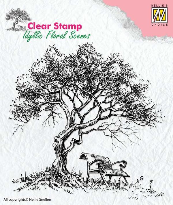
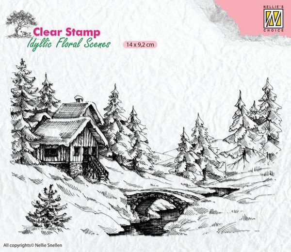
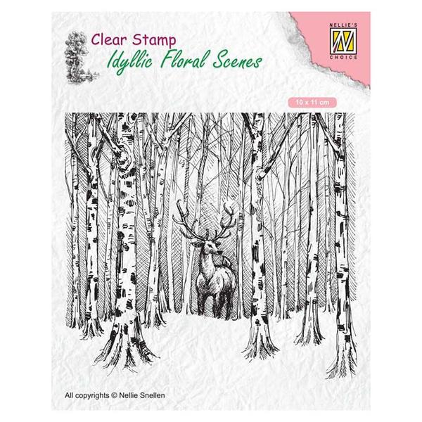
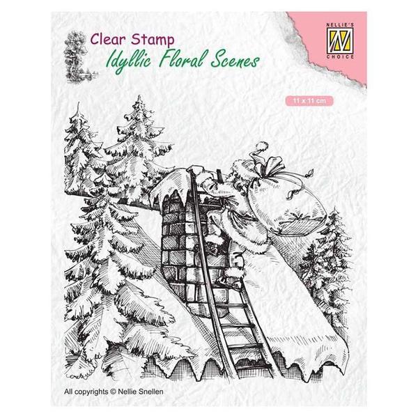
There are so many to choose from and there are even some great winter and Christmas scene stamps.
Here are a few things to keep in mind when working with large scene stamps.For these stamps it's beneficial if you have a stamp positioning platform like the Stamping Buddy Pro, because sometimes it's difficult to stamp the entire image in one go. So having the stamping platform just makes it easier for you to get a clear crisp image by stamping a few times in the same place if you need to.
I also used Versafine Clair to stamp the image. I used this ink because it will hold up to any medium that I choose to color the image in with like water color or marker.
Next you need to decide what your going to color you image in with. There are many options, for example you can use IZINK dye ink mixed with water to watercolor you image, water color pencil crayons or even distress oxide inks. So many possibilities, so try using something from your stash.
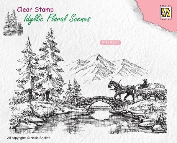
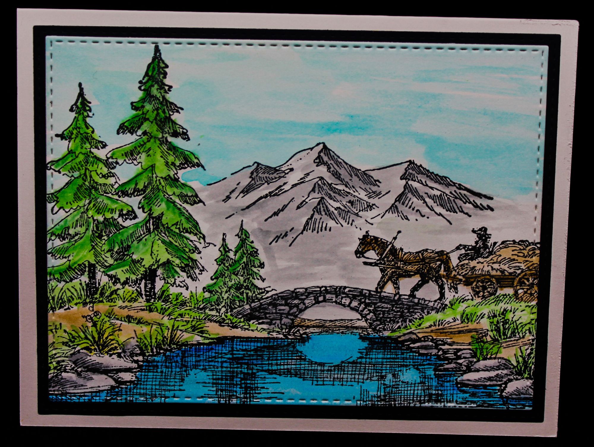
Let's take a look at this first sample. Here I use the Idyllic Floral Scene Stamp Horse and Cart, stamped it in black versafine clair and colored it in using a combination of IZINK dye ink and watercolor pencils. You don't have to be great at coloring as you can see here, it's just about adding the color to the right places. I used darker blue in the water where the stamp show's me there is shadow and lighter blue in the not shaded in areas. Same goes for the trees, using darker green where the stamp shows me there is shadow.
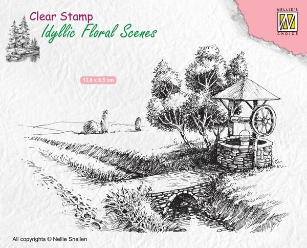
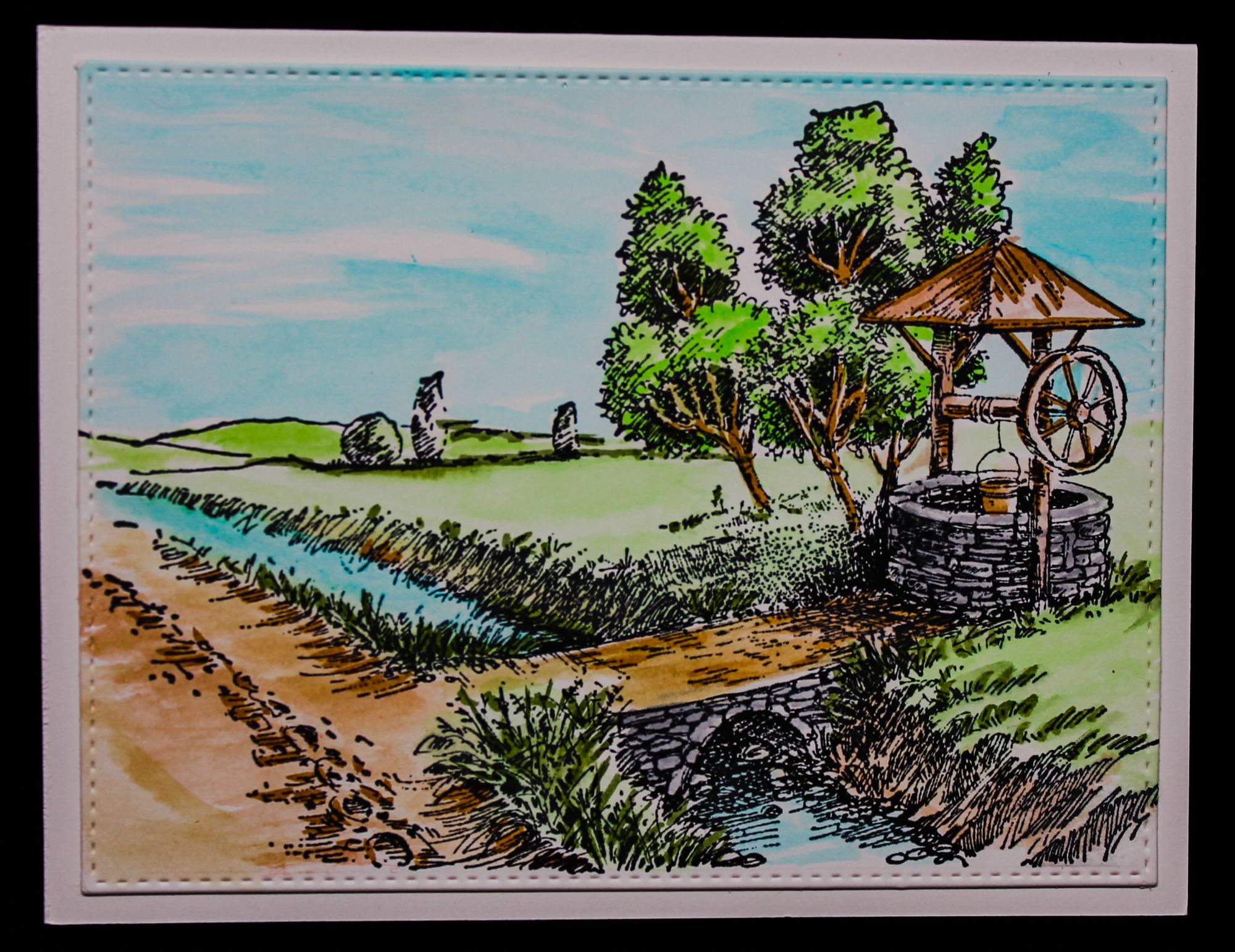
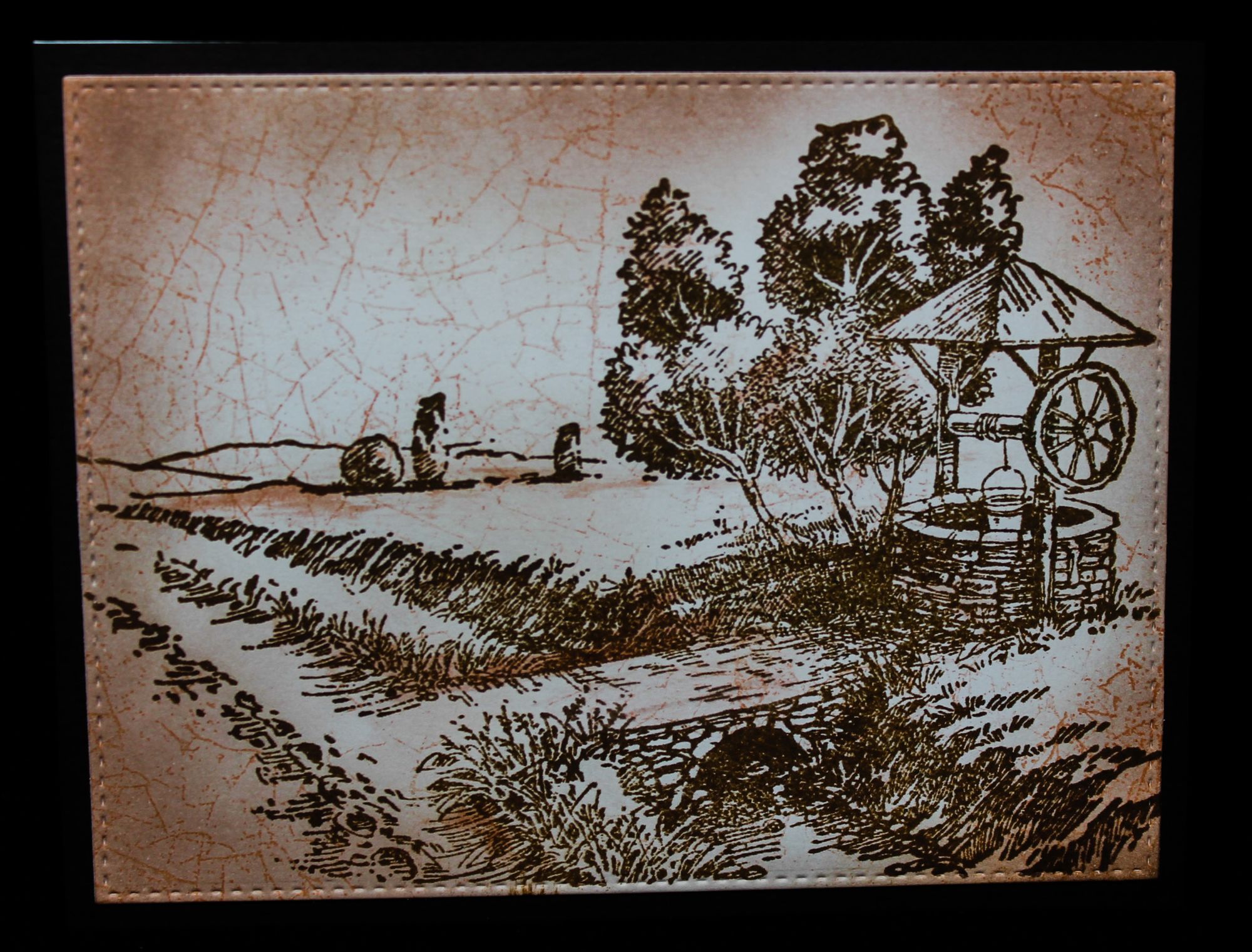
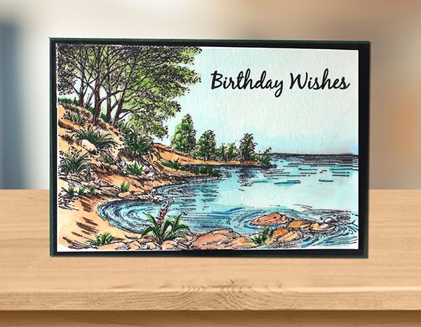
The next card sample I used the Idyllic Floral Scene Stamp Well to make these cards. The first sample I used IZINK dye ink to give the entire image a base color and then I went in with my markers to add more color and to shade in the darker areas in the scene. For the other sample I was going for a vintage look and stamped my image with Sepia Versafine as well as adding color to the edges. I used the stamp set from Marianne Design Texture Stamp - Crackle to add the crackle finish to the card. I used the Tea Dye ink from IZINK to stamp the crackle.
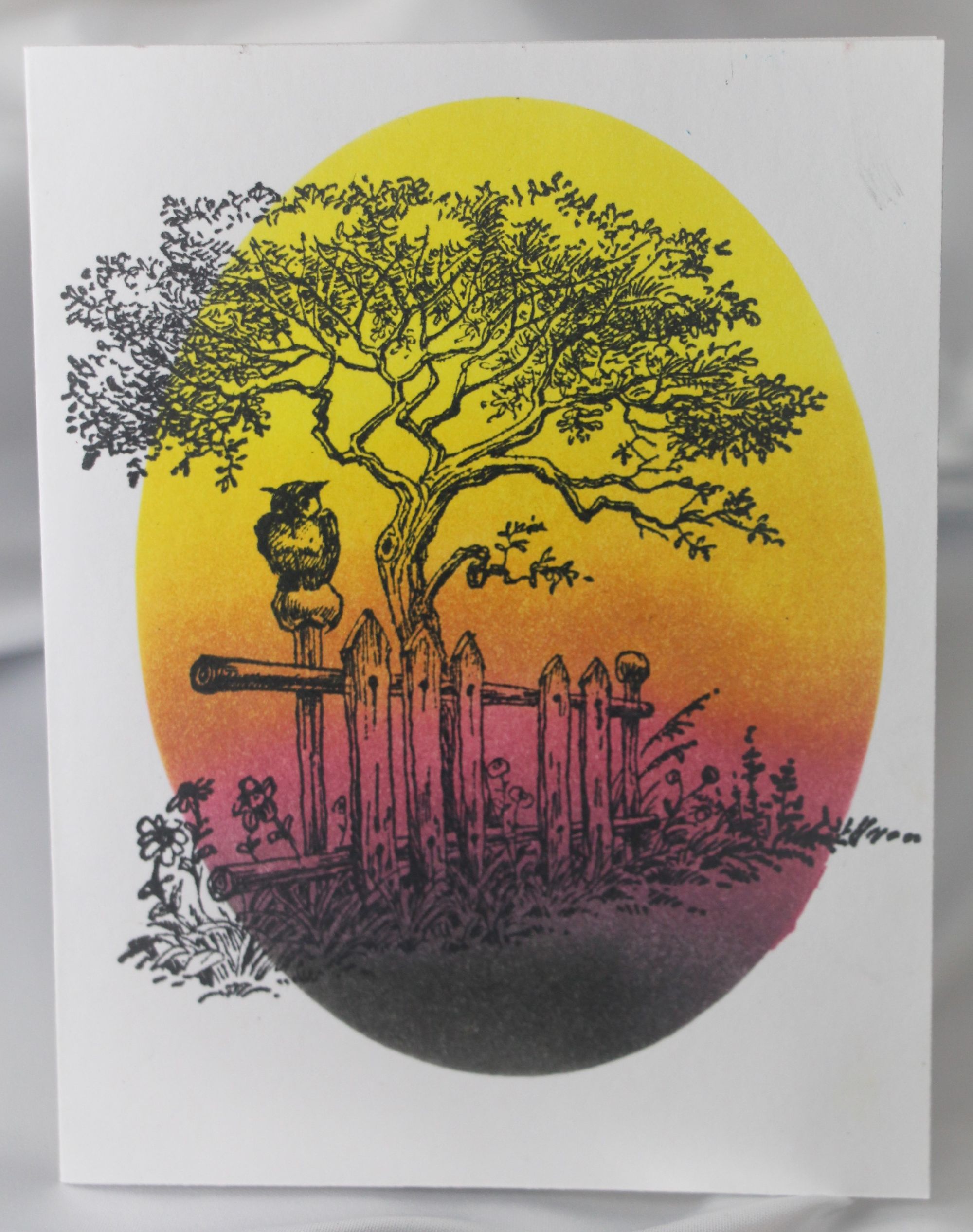
For this scene stamp I decided to use the Oval Mask from Creative Expressions to maks off an area in the center of the card front, do some ink blending using my Distress Oxide Inks. Once the ink is dry stamp the scene image on top of the blending.
There are so many different ways you can use these scene stamps and I hope that I inspired you a little today. Have fun with it.
Until next project
Katarina
Idyllic Floral Scene Stamp Horse and Cart